
Customizing Themes
Theming refers to the colors used in your hub's interface. For each color in the UI, there is a variable that stores the color value and is applied to UI Elements such as buttons, input fields, menus, etc.
Table of Contents
Theme JSON
Theme Variables Guide
In-App Themes
Learn about Themes
Theme JSON
You can add completely customized color schemes from the Admin Panel by copying and pasting a theme JSON, like the example below:
[
  {
    "id": "hubs-default",
    "default": true,
    "name": "Hubs Default",
    "variables": {
      "loading-screen-background": "radial-gradient(100% 160.26% at 100% 50%, #EBEBEB 0%, #FFFFFF 46.87%, #EBEBEB 100%)",
      "primary-color": "#1700C7",
      "primary-color-hover": "#170696",
      "secondary-color": "#FFFFFF",
      "secondary-color-hover": "#E7E7E7",
      "secondary-color-pressed": "#E7E7E7",
      "link-color": "#1700C7",
      "accent1-color": "#F04F5F",
      "accent1-color-hover": "#D43F57",
      "accent1-color-pressed": "#D43F57",
      "toolbar-label-accent1": "#FFFFFF",
      "accent1-border-color": "#F04F5F",
      "accent2-color": "#47D3CA",
      "accent2-color-hover": "#42CAC1",
      "accent2-color-pressed": "#42CAC1",
      "toolbar-label-accent2": "#616161",
      "accent2-border-color": "#47D3CA",
      "accent3-color": "#92D147",
      "accent3-color-hover": "#83C832",
      "accent3-color-pressed": "#83C832",
      "toolbar-label-accent3": "#FFFFFF",
      "accent3-border-color": "#92D147",
      "accent4-color": "#1700C7",
      "accent4-color-hover": "#170696",
      "accent4-color-pressed": "#170696",
      "toolbar-label-accent4": "#FFFFFF",
      "accent4-border-color": "#1700C7",
      "accent5-color": "#FF806F",
      "accent5-color-hover": "#F0705F",
      "accent5-color-pressed": "#F0705F",
      "toolbar-label-accent5": "#FFFFFF",
      "accent5-border-color": "#FF806F",
      "cancel": "#E1465F",
      "accept-color": "#92D147",
      "accept-color-hover": "#85C23C",
      "accept-color-pressed": "#21242C",
      "accept-border-color": "#7ED320",
      "text1-color": "#000000",
      "text1-color-hover": "#2C2C2C",
      "text1-color-pressed": "#2C2C2C",
      "text2-color": "#616161",
      "text2-color-hover": "#616161",
      "text2-color-pressed": "#616161",
      "text3-color": "#BBBBBB",
      "text3-color-hover": "#C7C7C7",
      "text3-color-pressed": "#ADADAD",
      "text4-color": "#868686",
      "text5-color": "#FFFFFF",
      "border1-color": "#E7E7E7",
      "border2-color": "#5D646C",
      "border3-color": "#5D646C",
      "outline-color": "#3A4049",
      "background1-color": "#FFFFFF",
      "background2-color": "#F5F5F5",
      "background3-color": "#E7E7E7",
      "background4-color": "#5D646C",
      "tip-text-color": "#FFFFFF",
      "tip-bg-color": "#000000",
      "tip-button-color-hover": "#E7E7E7",
      "input-bg-color": "#FFFFFF",
      "active-text-color": "#2B313B",
      "active-color-hover": "#E8EFFD",
      "active-color-pressed": "#D0DEFB",
      "action-color": "#000000",
      "action-color-highlight": "#149CE2",
      "action-label-color": "#5634FF",
      "notice-background-color": "#000000",
      "admin-color": "#13A4ED",
      "toolbar-basic-selected-icon-color": "#2B313B",
      "toolbar-basic-icon-color": "#000000",
      "toolbar-basic-color-hover": "#E7E7E7",
      "toolbar-basic-border-color": "#E7E7E7",
      "toolbar-icon-selected-bg": "#FFFFFF",
      "basic-color": "#FFFFFF",
      "basic-color-hover": "#E7E7E7",
      "basic-color-pressed": "#E7E7E7",
      "background-hover-color": "#E7E7E7",
      "basic-border-color": "#E7E7E7",
      "link-color-hover": "#1700C7",
      "radio-bg-color": "#FFFFFF"
    }
  },
  {
    "name": "Hubs Dark Mode",
    "id": "hubs-dark-mode",
    "darkModeDefault": true,
    "variables": {
      "loading-screen-background": " linear-gradient(110.71deg, #499CBE 0.79%, #1D11C6 32.83%, #6B30AF 67.96%, #E67577 100%);",
      "primary-color": "#6E5BFF",
      "primary-color-hover": "#7967FF",
      "secondary-color": "#FFFFFF",
      "secondary-color-hover": "#E7E7E7",
      "secondary-color-pressed": "#E7E7E7",
      "link-color": "#6E5BFF",
      "link-color-hover": "#7967FF",
      "link-color-pressed": "#7967FF",
      "accent1-color": "#F04F5F",
      "accent1-color-hover": "#D43F57",
      "accent1-color-pressed": "#D43F57",
      "toolbar-label-accent1": "#FFFFFF",
      "accent1-border-color": "#F04F5F",
      "accent2-color": "#47D3CA",
      "accent2-color-hover": "#3CC6BD",
      "accent2-color-pressed": "#42CAC1",
      "toolbar-label-accent2": "#FFFFFF",
      "accent2-border-color": "#47D3CA",
      "accent3-color": "#92D147",
      "accent3-color-hover": "#83C832",
      "accent3-color-pressed": "#83C832",
      "toolbar-label-accent3": "#FFFFFF",
      "accent3-border-color": "#92D147",
      "accent4-color": "#6E5BFF",
      "accent4-color-hover": "#5C4ADF",
      "accent4-color-pressed": "#5C4ADF",
      "toolbar-label-accent4": "#FFFFFF",
      "accent4-border-color": "#6E5BFF",
      "accent5-color": "#FF806F",
      "accent5-color-hover": "#F0705F",
      "accent5-color-pressed": "#F0705F",
      "toolbar-label-accent5": "#FFFFFF",
      "accent5-border-color": "#FF806F",
      "cancel": "#E1465F",
      "accept-color": "#92D147",
      "accept-color-hover": "#7FBF33",
      "accept-color-pressed": "#7FBF33",
      "accept-border-color": "#92D147",
      "text1-color": "#EAEAEA",
      "text1-color-hover": "#EAEAEA",
      "text1-color-pressed": "#EAEAEA",
      "text2-color": "#E7E7E7",
      "text2-color-hover": "#E7E7E7",
      "text2-color-pressed": "#E7E7E7",
      "text3-color": "#BBBBBB",
      "text3-color-hover": "#C7C7C7",
      "text3-color-pressed": "#ADADAD",
      "text4-color": "#FFFFFF",
      "text5-color": "#FFFFFF",
      "border1-color": "#463F78",
      "border2-color": "#433C75",
      "border3-color": "#3B346D",
      "outline-color": "#3A4049",
      "background1-color": "#28244B",
      "background2-color": "#302B52",
      "background3-color": "#352F5F",
      "background4-color": "#383267",
      "tip-text-color": "#FFFFFF",
      "tip-bg-color": "#000000",
      "tip-button-color-hover": "#E7E7E7",
      "input-bg-color": "#5D646C",
      "active-text-color": "#EAEAEA",
      "active-color": "#7967FF",
      "active-color-hover": "#6E5BFF",
      "active-color-pressed": "#6E5BFF",
      "action-color": "#000000",
      "action-color-highlight": "#6E5BFF",
      "action-label-color": "#5634FF",
      "notice-background-color": "#000000",
      "admin-color": "#70D9DE",
      "toolbar-basic-selected-icon-color": "#2B313B",
      "toolbar-basic-icon-color": "#EAEAEA",
      "toolbar-basic-color-hover": "#FFFFFF",
      "toolbar-basic-border-color": "#6E5BFF",
      "toolbar-icon-selected-bg": "#FFFFFF",
      "toggle-button-color": "#6E5BFF",
      "basic-color": "#2B2560",
      "basic-color-hover": "#362E79",
      "basic-color-pressed": "#362E79",
      "background-hover-color": "#E7E7E7",
      "basic-border-color": "#E7E7E7",
      "tile-bg-color": "#3B346D",
      "tile-bg-color-hover": "#362E79",
      "tile-bg-color-pressed": "#362E79"
    }
  }
]
Use the boolean attributes, "default" and "darkModeDefault" to set a default theme from your custom themes array.
Theme Variables Guide
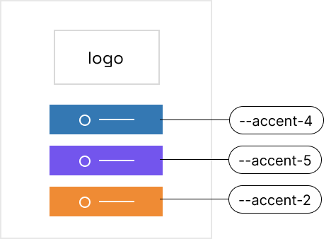
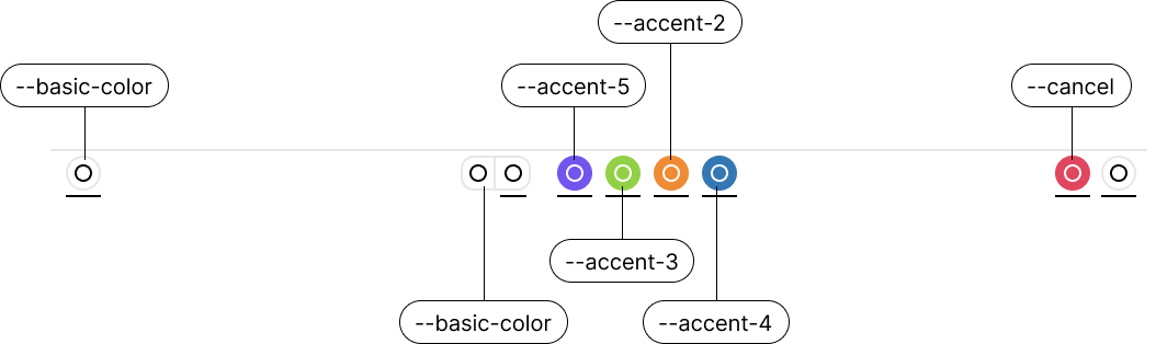
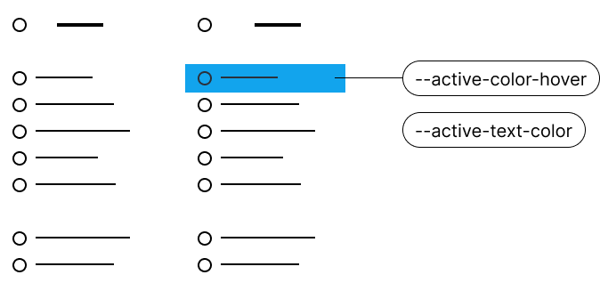
While not exhuastive, these diagrams will outline a few key variables that you can use in your themes.
Entry Screen
Bottom Toolbar
Menus
In-App Themes
The in-world User Interface (e.g the menu you get when hovering your cursor over an object and pressing spacebar) is themed with the following variables: "action-color", "action-label-color", "action-color-disabled", "action-color-highlight", "action-text-color", "action-subtitle-color", "notice-background-color", "notice-text-color", "favorited-color".
Learn about Themes
There are some great tools you can use to learn more about theme-ing your hub.
You can learn about working with JSON from MDN Web Docs.
Storybook, an open source tool for building UI components and pages in isolation, is very helpful in customizing themeing. To run storybook locally you can use the command npm run storybook to preview components and themes.